Time Series - Displaying time series, spatial and space-time data with R
Table of Contents
Time on the horizontal axis
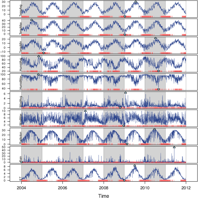
Time Graph of Variables with Different Scales
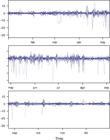
Time Series of Variables with the Same Scale
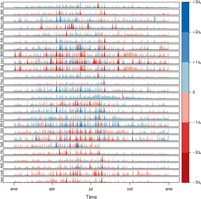
The Horizon Graph
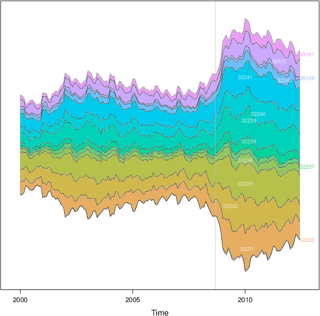
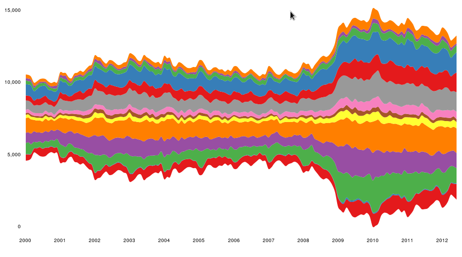
Stacked Graphs
Interactive
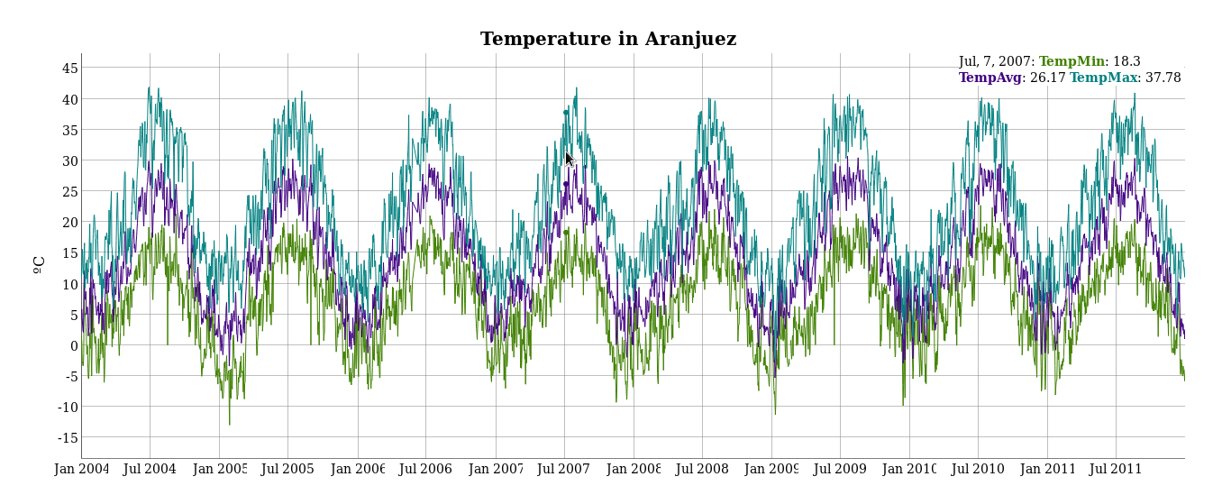
dygraphs
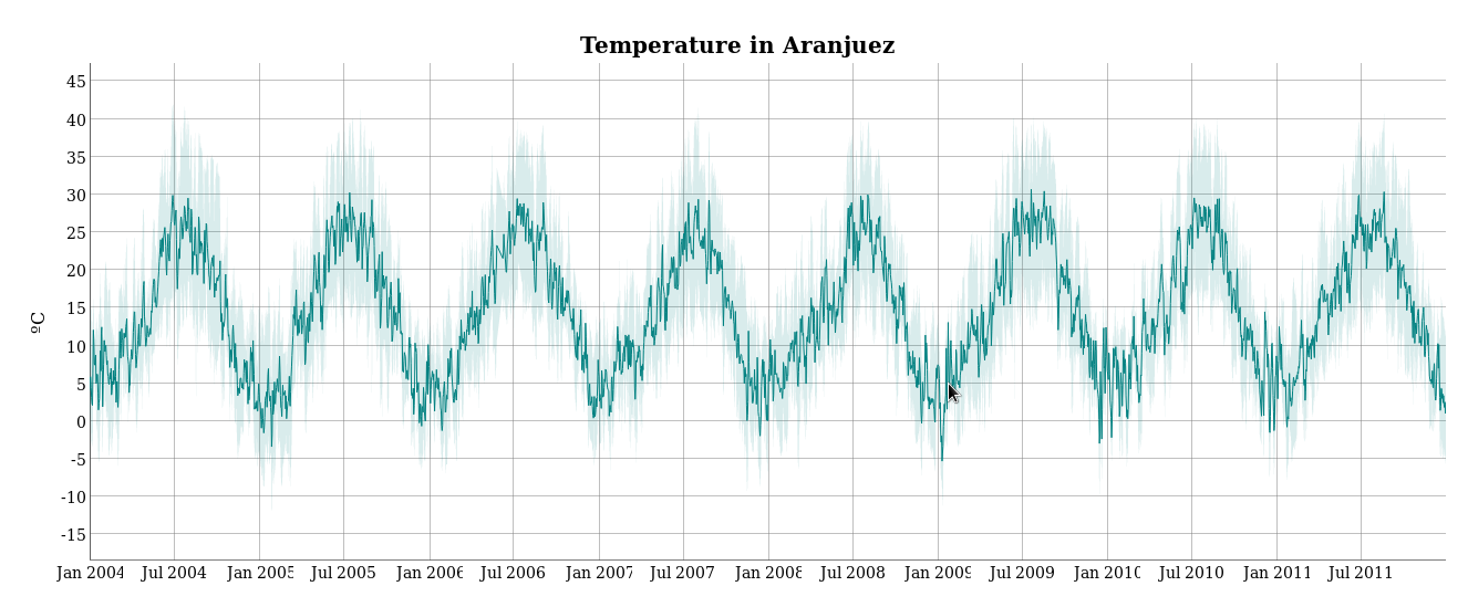
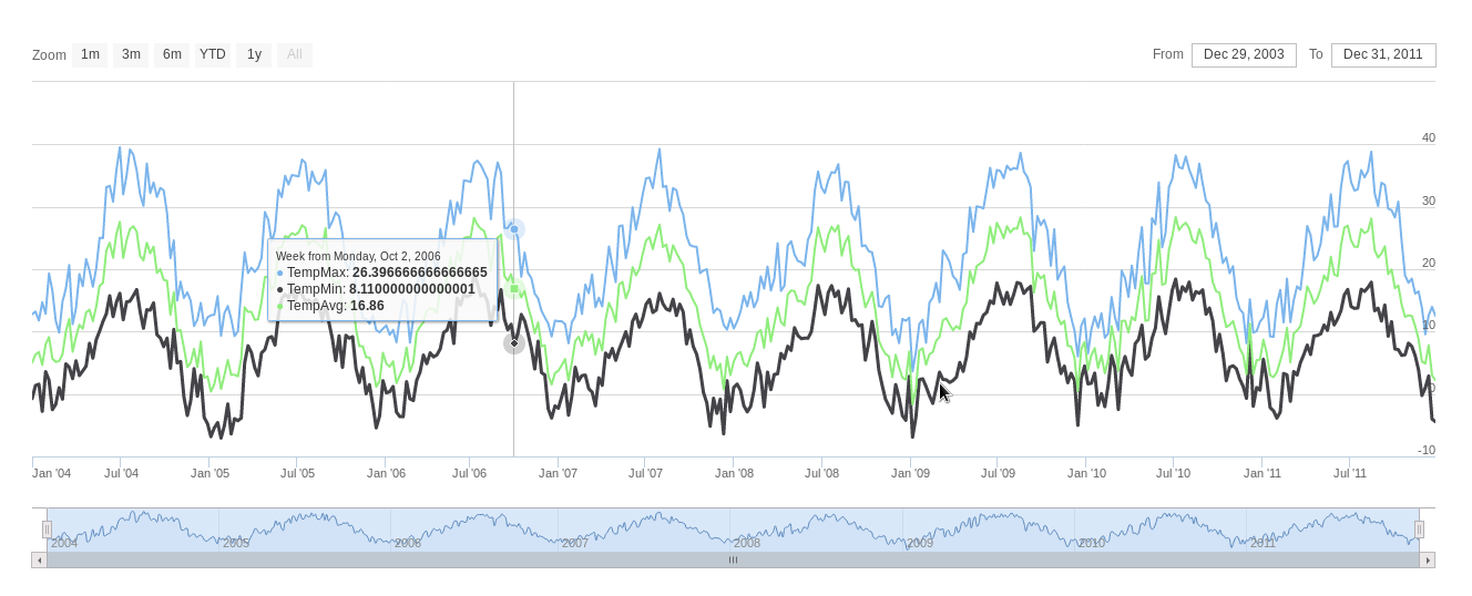
highcharter
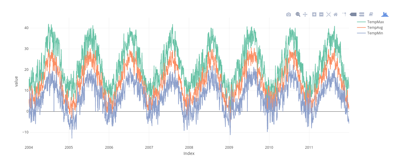
plotly
streamgraph
Time as a conditioning or grouping variable
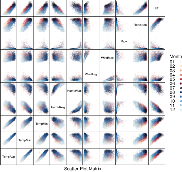
Scatterplot Matrix: Time as a Grouping Variable
Scatterplot with Time as a Conditioning Variable
Time as a complementary variable
Polylines
Labels to Show Time Information
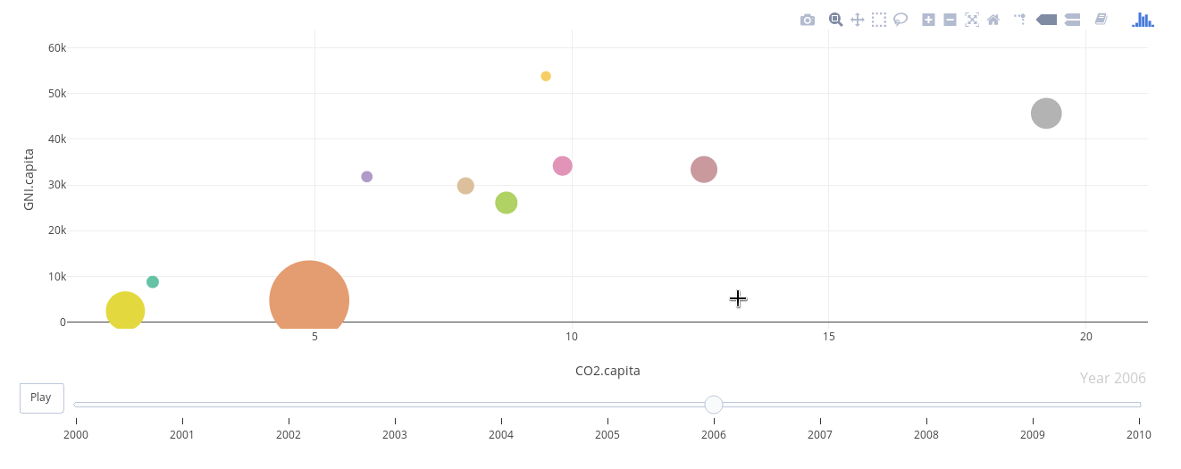
Using Variable Size to Encode an Additional Variable
Interactive graphics: animation
plotly
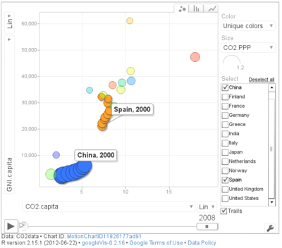
googleVis
gridSVG

Code
Time on the horizontal axis
##################################################################
## Initial configuration
##################################################################
## Clone or download the repository and set the working directory
## with setwd to the folder where the repository is located.

library(lattice)
library(ggplot2)
## latticeExtra must be loaded after ggplot2 to prevent masking of its
## `layer` function.
library(latticeExtra)

source('configLattice.R')
##################################################################

##################################################################
## Time graph of variables with different scales
##################################################################

library(zoo)
load('data/aranjuez.RData')

## The layout argument arranges panels in rows
xyplot(aranjuez, layout = c(1, ncol(aranjuez)))

autoplot(aranjuez) + facet_free()

##################################################################
## Annotations to enhance the time graph
##################################################################

## lattice version

## Auxiliary function to extract the year value of a POSIXct time
## index
Year <- function(x)format(x, "%Y")

xyplot(aranjuez,
       layout = c(1, ncol(aranjuez)),
       strip = FALSE,
       scales = list(y = list(cex = 0.6, rot = 0)),
       panel = function(x, y, ...){
           ## Alternation of years
           panel.xblocks(x, Year,
                         col = c("lightgray", "white"),
                         border = "darkgray")
           ## Values under the average highlighted with red regions
           panel.xblocks(x, y < mean(y, na.rm = TRUE),
                         col = "indianred1",
                         height = unit(0.1, 'npc'))
           ## Time series
           panel.lines(x, y, col = 'royalblue4', lwd = 0.5, ...)
           ## Label of each time series
           panel.text(x[1], min(y, na.rm = TRUE),
                      names(aranjuez)[panel.number()],
                      cex = 0.6, adj = c(0, 0), srt = 90, ...)
           ## Triangles to point the maxima and minima
           idxMax <- which.max(y)
           panel.points(x[idxMax], y[idxMax],
                        col = 'black', fill = 'lightblue', pch = 24)
           idxMin <- which.min(y)
           panel.points(x[idxMin], y[idxMin],
                        col = 'black', fill = 'lightblue', pch = 25)
       })

## ggplot2 version

timeIdx <- index(aranjuez)

aranjuezLong <- fortify(aranjuez, melt = TRUE)

summary(aranjuezLong)

## Values below mean are negative after being centered
scaled <- fortify(scale(aranjuez, scale = FALSE), melt = TRUE)
## The 'scaled' column is the result of the centering.
## The new 'Value' column store the original values.
scaled <- transform(scaled, scaled = Value,
                    Value = aranjuezLong$Value)
underIdx <- which(scaled$scaled <= 0)
## 'under' is the subset of values below the average
under <- scaled[underIdx,]

library(xts)
ep <- endpoints(timeIdx, on = 'years')
ep <- ep[-1]
N <- length(ep)
## 'tsp' is start and 'tep' is the end of each band. One of each two
## years are selected.
tep <- timeIdx[ep[seq(1, N, 2)] + 1]
tsp <- timeIdx[ep[seq(2, N, 2)]]

minIdx <- timeIdx[apply(aranjuez, 2, which.min)]
minVals <- apply(aranjuez, 2, min, na.rm = TRUE)
mins <- data.frame(Index = minIdx,
                   Value = minVals,
                   Series = names(aranjuez))

maxIdx <- timeIdx[apply(aranjuez, 2, which.max)]
maxVals <- apply(aranjuez, 2, max, na.rm = TRUE)
maxs <- data.frame(Index = maxIdx,
                   Value = maxVals,
                   Series = names(aranjuez))

ggplot(data = aranjuezLong, aes(Index, Value)) +
    ## Time series of each variable
    geom_line(colour = "royalblue4", lwd = 0.5) +
    ## Year bands
    annotate('rect',
             xmin = tsp, xmax = tep,
             ymin = -Inf, ymax = Inf,
              alpha = 0.4) +
    ## Values below average
    geom_rug(data = under,
             sides = 'b', col = 'indianred1') +
    ## Minima
    geom_point(data = mins, pch = 25) +
    ## Maxima
    geom_point(data = maxs, pch = 24) +
    ## Axis labels and theme definition
    labs(x = 'Time', y = NULL) +
    theme_bw() +
    ## Each series is displayed in a different panel with an
    ## independent y scale
    facet_free()

##################################################################
## Time series of variables with the same scale
##################################################################

load('data/navarra.RData')

avRad <- zoo(rowMeans(navarra, na.rm = 1), index(navarra))
pNavarra <- xyplot(navarra - avRad,
                   superpose = TRUE, auto.key = FALSE,
                   lwd = 0.5, alpha = 0.3, col = 'midnightblue')
pNavarra

##################################################################
## Aspect ratio and rate of change
##################################################################

xyplot(navarra - avRad,
       aspect = 'xy', cut = list(n = 3, overlap = 0.1),
       strip = FALSE,
       superpose = TRUE, auto.key = FALSE,
       lwd = 0.5, alpha = 0.3, col = 'midnightblue')

##################################################################
## The horizon graph
##################################################################

library(latticeExtra)

horizonplot(navarra - avRad,
            layout = c(1, ncol(navarra)),
            origin = 0, ## Deviations in each panel are calculated
                        ## from this value
            colorkey = TRUE,
            col.regions = brewer.pal(6, "RdBu"))

##################################################################
## Time graph of the differences between a time series and a reference
##################################################################

Ta <- aranjuez$TempAvg
timeIndex <- index(aranjuez)
longTa <- ave(Ta, format(timeIndex, '%j'))
diffTa <- (Ta - longTa)

xyplot(cbind(Ta, longTa, diffTa),
       col = c('darkgray', 'red', 'midnightblue'),
       superpose = TRUE, auto.key = list(space = 'right'),
       screens = c(rep('Average Temperature', 2), 'Differences'))

years <- unique(format(timeIndex, '%Y'))

horizonplot(diffTa, cut = list(n = 8, overlap = 0),
            colorkey = TRUE,
            col.regions = brewer.pal(6, "RdBu"),
            layout = c(1, 8),
            scales = list(draw = FALSE, y = list(relation = 'same')),
            origin = 0, strip.left = FALSE) +
    layer(grid.text(years[panel.number()], x  =  0, y  =  0.1,
                    gp = gpar(cex = 0.8),
                    just = "left"))

year <- function(x)as.numeric(format(x, '%Y'))
day <- function(x)as.numeric(format(x, '%d'))
month <- function(x)as.numeric(format(x, '%m'))

myTheme <- modifyList(custom.theme(region = brewer.pal(9, 'RdBu')),
                      list(
                          strip.background = list(col = 'gray'),
                          panel.background = list(col = 'gray')))

maxZ <- max(abs(diffTa))

levelplot(diffTa ~ day(timeIndex) * year(timeIndex) | factor(month(timeIndex)),
          at = pretty(c(-maxZ, maxZ), n = 8),
          colorkey = list(height = 0.3),
          layout = c(1, 12), strip = FALSE, strip.left = TRUE,
          xlab = 'Day', ylab = 'Month',
          par.settings = myTheme)

df <- data.frame(Vals = diffTa,
                 Day = day(timeIndex),
                 Year = year(timeIndex),
                 Month = month(timeIndex))

library(scales)
## The packages scales is needed for the pretty_breaks function.

ggplot(data = df,
       aes(fill = Vals,
           x = Day,
           y = Year)) +
    facet_wrap(~ Month, ncol = 1, strip.position = 'left') +
    scale_y_continuous(breaks = pretty_breaks()) +
    scale_fill_distiller(palette = 'RdBu', direction = 1) +
    geom_raster() +
    theme(panel.grid.major = element_blank(),
          panel.grid.minor = element_blank())

##################################################################
## Stacked graphs
##################################################################

load('data/unemployUSA.RData')

xyplot(unemployUSA,
       superpose = TRUE,
       par.settings = custom.theme,
       auto.key = list(space = 'right'))

library(scales) ## scale_x_yearmon needs scales::pretty_breaks
autoplot(unemployUSA, facets = NULL, geom = 'area') +
    geom_area(aes(fill = Series)) +
    scale_x_yearmon()

panel.flow <- function(x, y, groups, origin, ...)
{
    dat <- data.frame(x = x, y = y, groups = groups) (dataframe)
    nVars <- nlevels(groups)
    groupLevels <- levels(groups)

    ## From long to wide
    yWide <- unstack(dat, y~groups) (yunstack)
    ## Where are the maxima of each variable located? We will use
    ## them to position labels.
    idxMaxes <- apply(yWide, 2, which.max)

    ##Origin calculated following Havr.eHetzler.ea2002
    if (origin=='themeRiver') origin =  -1/2*rowSums(yWide)
    else origin = 0
    yWide <- cbind(origin = origin, yWide)
    ## Cumulative sums to define the polygon
    yCumSum <- t(apply(yWide, 1, cumsum)) (ycumsum)
    Y <- as.data.frame(sapply(seq_len(nVars), (yPolygon)
                              function(iCol)c(yCumSum[,iCol+1],
                                              rev(yCumSum[,iCol]))))
    names(Y) <- levels(groups)
    ## Back to long format, since xyplot works that way
    y <- stack(Y)$values (yStack)

    ## Similar but easier for x
    xWide <- unstack(dat, x~groups) (xunstack)
    x <- rep(c(xWide[,1], rev(xWide[,1])), nVars) (xPolygon)
    ## Groups repeated twice (upper and lower limits of the polygon)
    groups <- rep(groups, each = 2) (groups)

    ## Graphical parameters
    superpose.polygon <- trellis.par.get("superpose.polygon") (gpar)
    col = superpose.polygon$col
    border = superpose.polygon$border
    lwd = superpose.polygon$lwd

    ## Draw polygons
    for (i in seq_len(nVars)){ (forVars)
        xi <- x[groups==groupLevels[i]]
        yi <- y[groups==groupLevels[i]]
        panel.polygon(xi, yi, border = border,
                      lwd = lwd, col = col[i])
    }

    ## Print labels
    for (i in seq_len(nVars)){
        xi <- x[groups==groupLevels[i]]
        yi <- y[groups==groupLevels[i]]
        N <- length(xi)/2
        ## Height available for the label
        h <- unit(yi[idxMaxes[i]], 'native') -
            unit(yi[idxMaxes[i] + 2*(N-idxMaxes[i]) +1], 'native')
        ##...converted to "char" units
        hChar <- convertHeight(h, 'char', TRUE)
        ## If there is enough space and we are not at the first or
        ## last variable, then the label is printed inside the polygon.
        if((hChar >= 1) && !(i %in% c(1, nVars))){ (hChar)
            grid.text(groupLevels[i],
                      xi[idxMaxes[i]],
                      (yi[idxMaxes[i]] +
                       yi[idxMaxes[i] + 2*(N-idxMaxes[i]) +1])/2,
                      gp = gpar(col = 'white', alpha = 0.7, cex = 0.7),
                      default.units = 'native')
        } else {
            ## Elsewhere, the label is printed outside

            grid.text(groupLevels[i],
                      xi[N],
                      (yi[N] + yi[N+1])/2,
                      gp = gpar(col = col[i], cex = 0.7),
                      just = 'left', default.units = 'native')
        }
    }
}

prepanel.flow <- function(x, y, groups, origin,...)
{
    dat <- data.frame(x = x, y = y, groups = groups)
    nVars <- nlevels(groups)
    groupLevels <- levels(groups)
    yWide <- unstack(dat, y~groups)
    if (origin=='themeRiver') origin =  -1/2*rowSums(yWide)
    else origin = 0
    yWide <- cbind(origin = origin, yWide)
    yCumSum <- t(apply(yWide, 1, cumsum))

    list(xlim = range(x), (xlim)
         ylim = c(min(yCumSum[,1]), max(yCumSum[,nVars+1])), (ylim)
         dx = diff(x), (dx)
         dy = diff(c(yCumSum[,-1])))
}

library(colorspace)
## We will use a qualitative palette from colorspace
nCols <- ncol(unemployUSA)
pal <- rainbow_hcl(nCols, c = 70, l = 75, start = 30, end = 300)
myTheme <- custom.theme(fill = pal, lwd = 0.2)

sep2008 <- as.numeric(as.yearmon('2008-09'))

xyplot(unemployUSA, superpose = TRUE, auto.key = FALSE,
       panel = panel.flow, prepanel = prepanel.flow,
       origin = 'themeRiver', scales = list(y = list(draw = FALSE)),
       par.settings = myTheme) +
    layer(panel.abline(v = sep2008, col = 'gray', lwd = 0.7))

##################################################################
## Panel and prepanel functions to implement the ThemeRiver with =xyplot=
##################################################################

library(dygraphs)

dyTemp <- dygraph(aranjuez[, c("TempMin", "TempAvg", "TempMax")],
                  main = "Temperature in Aranjuez",
                  ylab = "ºC")

dyTemp

dyTemp %>%
    dyHighlight(highlightSeriesBackgroundAlpha = 0.2,
                highlightSeriesOpts = list(strokeWidth = 2))

dygraph(aranjuez[, c("TempMin", "TempAvg", "TempMax")],
        main = "Temperature in Aranjuez",
        ylab = "ºC") %>%
    dySeries(c("TempMin", "TempAvg", "TempMax"),
             label = "Temperature")

library(highcharter)
library(xts)

aranjuezXTS <- as.xts(aranjuez)

highchart(type = "stock") %>%
    hc_add_series(name = 'TempMax',
                      aranjuezXTS[, "TempMax"]) %>%
    hc_add_series(name = 'TempMin',
                      aranjuezXTS[, "TempMin"]) %>%
    hc_add_series(name = 'TempAvg',
                      aranjuezXTS[, "TempAvg"])

aranjuezDF <- fortify(aranjuez[,
                               c("TempMax",
                                 "TempAvg",
                                 "TempMin")],
                      melt = TRUE)

summary(aranjuezDF)

library(plotly)

plot_ly(aranjuezDF) %>%
    add_lines(x = ~ Index,
              y = ~ Value,
              color = ~ Series)

unemployDF <- fortify(unemployUSA, melt = TRUE)

head(unemployDF)

## remotes::install_github("hrbrmstr/streamgraph")
library(streamgraph)

streamgraph(unemployDF,
            key = "Series",
            value = "Value",
            date = "Index") %>%
    sg_axis_x(1, "year", "%Y") %>%
    sg_fill_brewer("Set1")
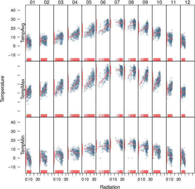
Time as a conditioning or grouping variable
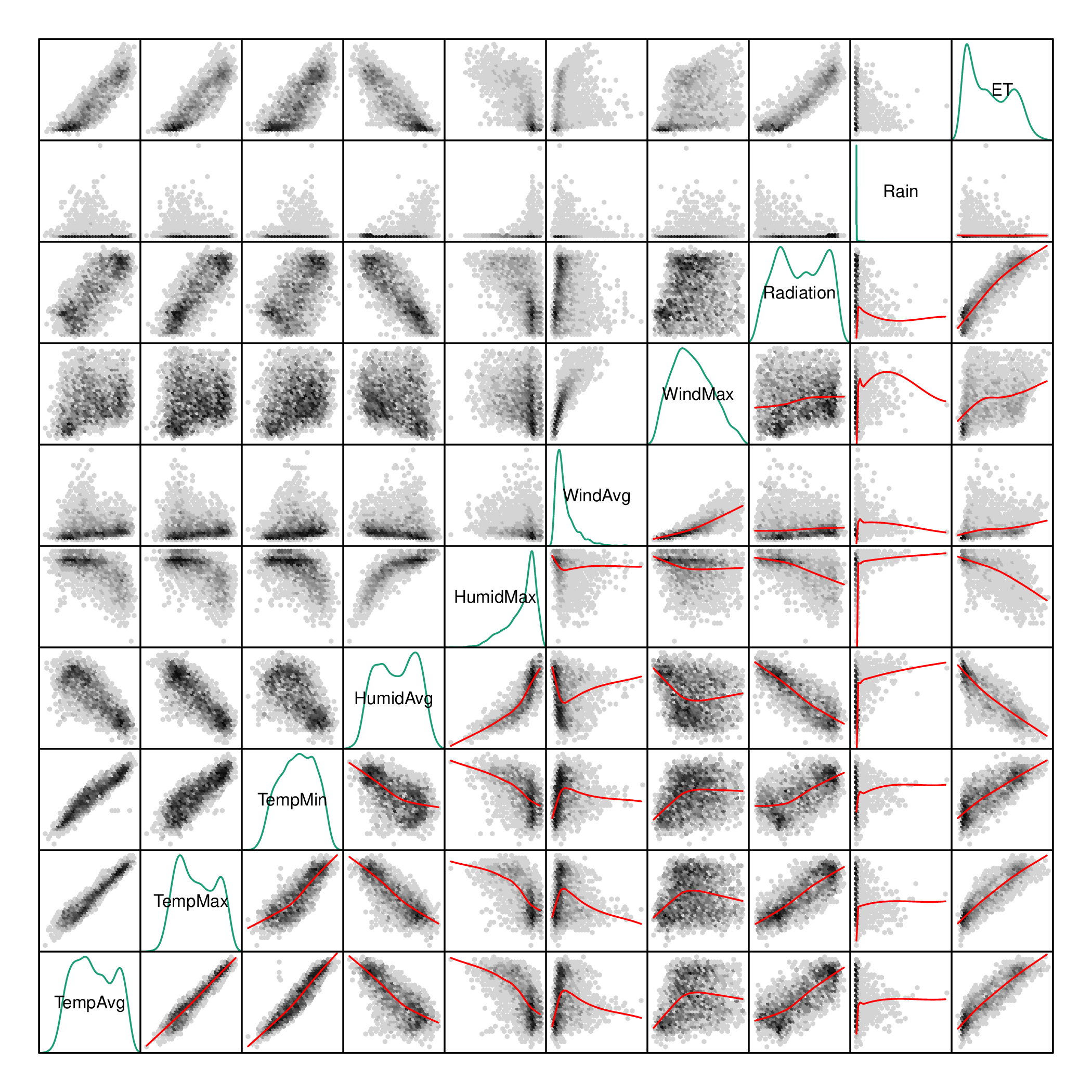
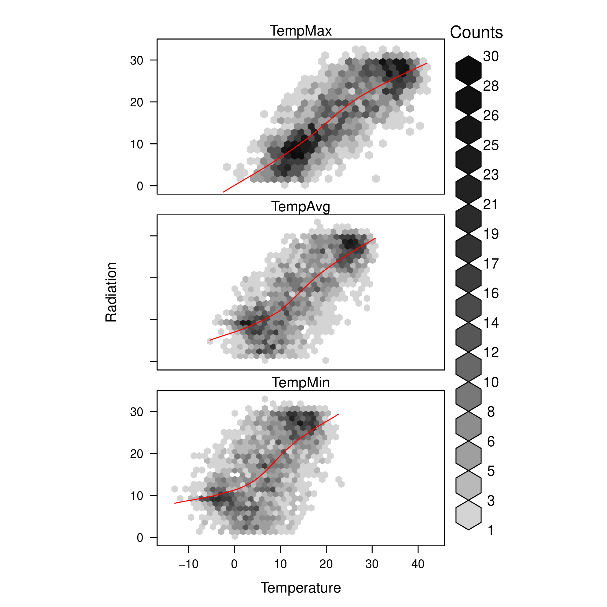
##################################################################
## Initial configuration
##################################################################
## Clone or download the repository and set the working directory
## with setwd to the folder where the repository is located.

library(lattice)
library(ggplot2)
## latticeExtra must be loaded after ggplot2 to prevent masking of its
## `layer` function.
library(latticeExtra)

source('configLattice.R')
##################################################################

##################################################################
## Scatterplot matrix: time as a grouping variable
##################################################################

library(zoo)

load('data/aranjuez.RData')
aranjuezDF <- as.data.frame(aranjuez)
aranjuezDF$Month <- format(index(aranjuez), '%m')

## Red-Blue palette with black added (12 colors)
colors <- c(brewer.pal(n = 11, 'RdBu'), '#000000')
## Rearrange according to months (darkest for summer)
colors <- colors[c(6:1, 12:7)]

splom(~ aranjuezDF[1:10],
      groups = aranjuezDF$Month,
      auto.key = list(space = 'right',
                    title = 'Month', cex.title = 1),
      pscale = 0, varname.cex = 0.7, xlab = '',
      par.settings = custom.theme(symbol = colors,
                                pch = 19),
      cex = 0.3, alpha = 0.1)

trellis.focus('panel', 1, 1)
idx <- panel.link.splom(pch = 13, cex = 0.6, col = 'green')
aranjuez[idx,]

library(GGally)

ggpairs(aranjuezDF,
        columns = 1:10, ## Do not include "Month"
        upper = list(continuous = "points"),
        mapping = aes(colour = Month, alpha = 0.1))

##################################################################
## Hexagonal binning
##################################################################

library(hexbin)

splom(~as.data.frame(aranjuez),
      panel = panel.hexbinplot,
      diag.panel = function(x, ...){
          yrng <- current.panel.limits()$ylim
          d <- density(x, na.rm = TRUE)
          d$y <- with(d, yrng[1] + 0.95 * diff(yrng) * y / max(y))
          panel.lines(d)
          diag.panel.splom(x, ...)
      },
      lower.panel = function(x, y, ...){
          panel.hexbinplot(x, y, ...)
          panel.loess(x, y, ..., col = 'red')
      },
      xlab = '',
      pscale = 0,
      varname.cex = 0.7)

library(reshape2)

aranjuezRshp <- melt(aranjuezDF,
                     measure.vars = c('TempMax',
                                      'TempAvg',
                                      'TempMin'),
                     variable.name = 'Statistic',
                     value.name = 'Temperature')

summary(aranjuezRshp)

hexbinplot(Radiation ~ Temperature | Statistic,
           data = aranjuezRshp,
           layout = c(1, 3)) +
    layer(panel.loess(..., col = 'red'))

ggplot(data = aranjuezRshp,
       aes(Temperature, Radiation)) +
    stat_binhex(ncol = 1) +
    stat_smooth(se = FALSE, method = 'loess', col = 'red') +
    facet_wrap(~ Statistic, ncol = 1) +
    theme_bw()

##################################################################
## Scatterplot with time as a conditioning variable
##################################################################

ggplot(data = aranjuezRshp, aes(Radiation, Temperature)) +
    facet_grid(Statistic ~ Month) +
    geom_point(col = 'skyblue4', pch = 19, cex = 0.5, alpha = 0.3) +
    geom_rug() +
    stat_smooth(se = FALSE, method = 'loess',
                col = 'indianred1', lwd = 1.2) +
    theme_bw()

useOuterStrips(
    xyplot(Temperature ~ Radiation | Month * Statistic,
           data = aranjuezRshp,
           between = list(x = 0),
           col = 'skyblue4', pch = 19,
           cex = 0.5, alpha = 0.3)) +
    layer({
        panel.rug(..., col.line = 'indianred1',
                  end = 0.05, alpha = 0.6)
        panel.loess(..., col = 'indianred1',
                    lwd = 1.5, alpha = 1)
    })
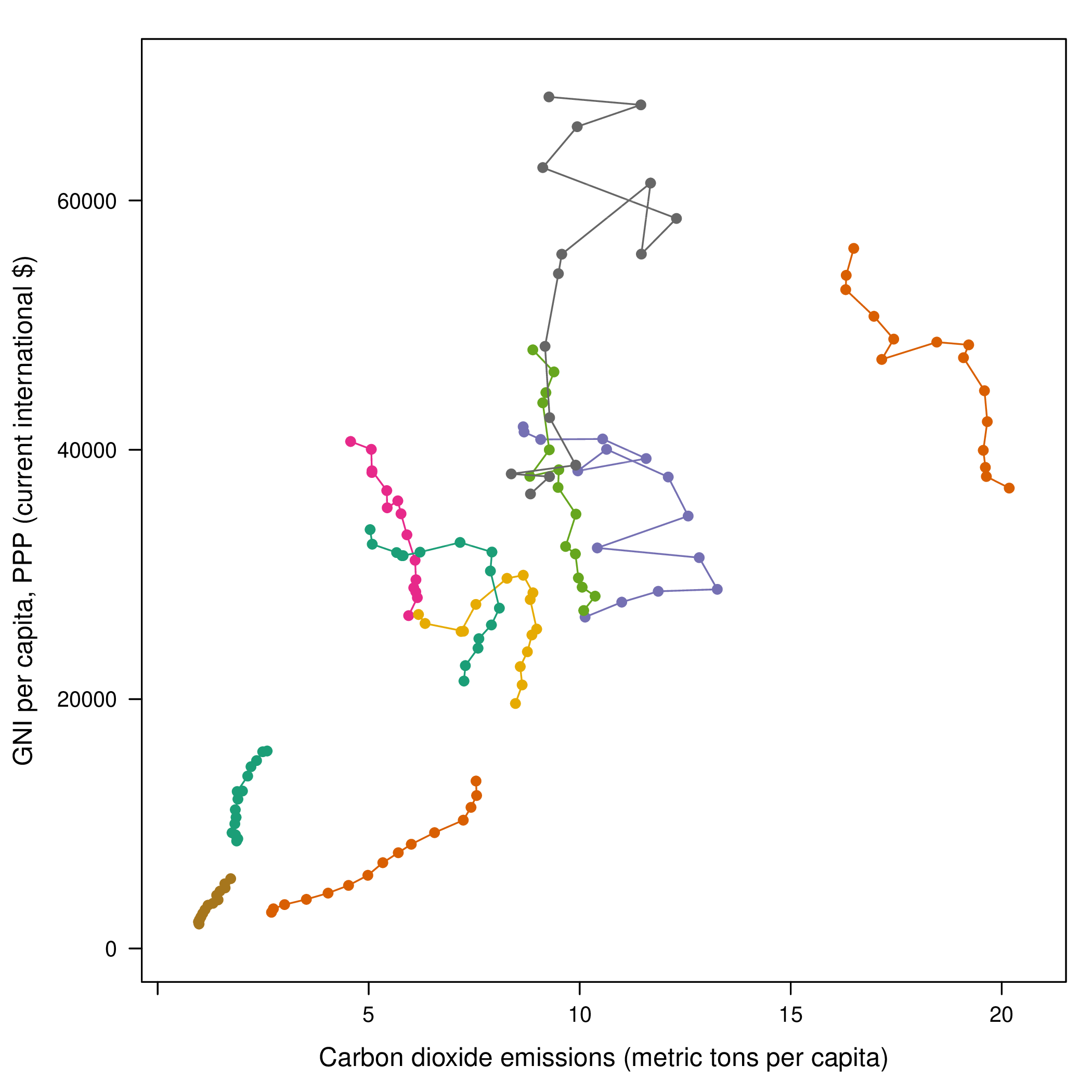
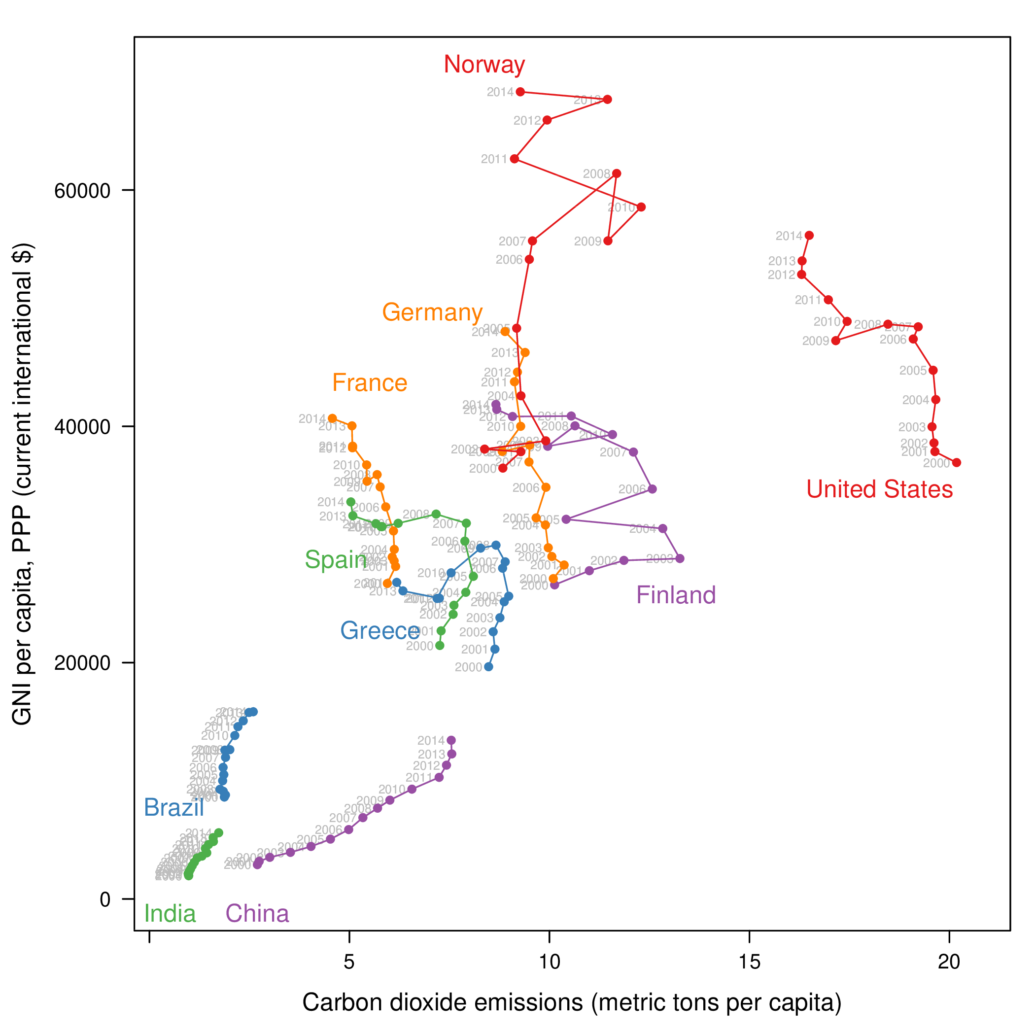
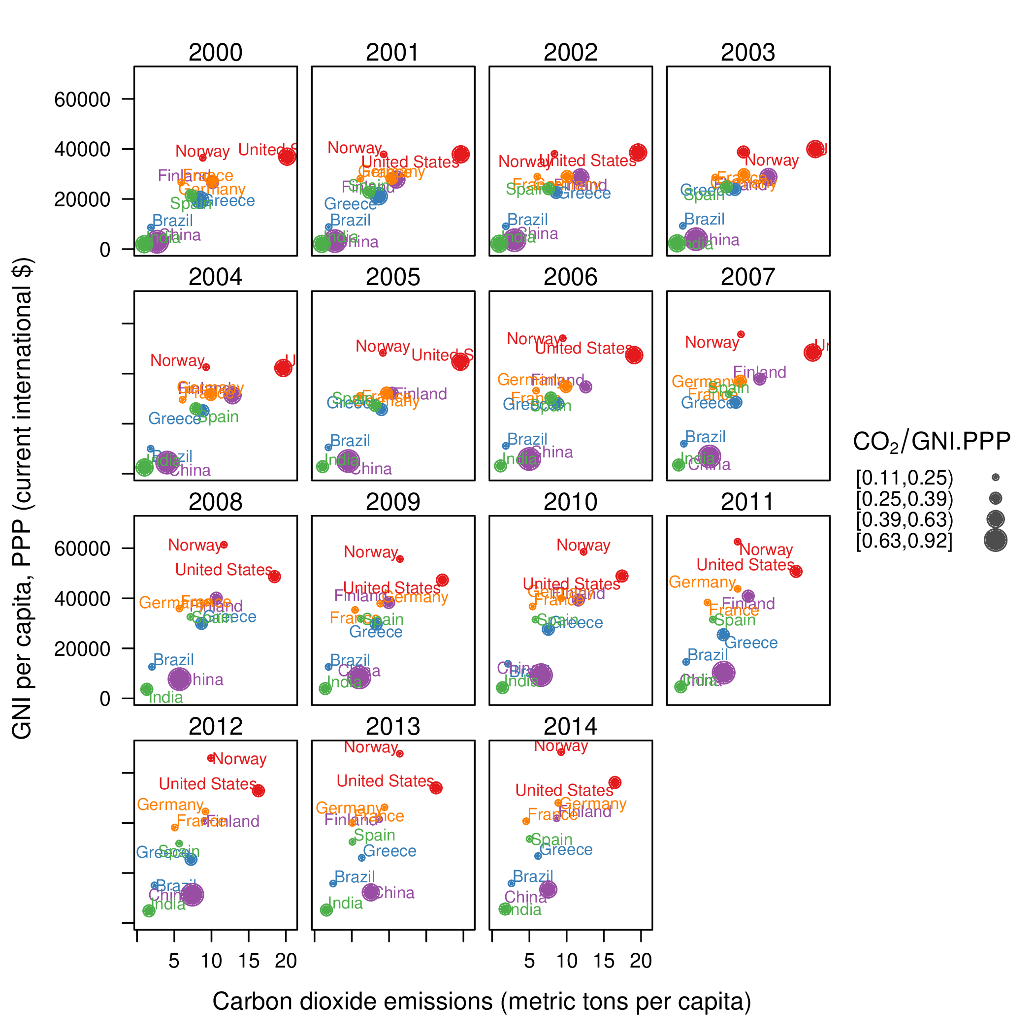
Time as a complementary variable
##################################################################
## Initial configuration
##################################################################
## Clone or download the repository and set the working directory
## with setwd to the folder where the repository is located.

library(lattice)
library(ggplot2)
## latticeExtra must be loaded after ggplot2 to prevent masking of its
## `layer` function.
library(latticeExtra)

source('configLattice.R')
##################################################################

##################################################################
## Polylines
##################################################################

library(zoo)

load('data/CO2.RData')

## lattice version
xyplot(GNI.capita  ~ CO2.capita, data = CO2data,
       xlab = "Carbon dioxide emissions (metric tons per capita)",
       ylab = "GNI per capita, PPP (current international $)",
       groups = Country.Name, type = 'b')

## ggplot2 version
ggplot(data = CO2data, aes(x = CO2.capita, y = GNI.capita,
                         color = Country.Name)) +
    xlab("Carbon dioxide emissions (metric tons per capita)") +
    ylab("GNI per capita, PPP (current international $)") +
    geom_point() + geom_path() + theme_bw()

##################################################################
## Choosing colors
##################################################################

library(RColorBrewer)

nCountries <- nlevels(CO2data$Country.Name)
pal <- brewer.pal(n = 5, 'Set1')
pal <- rep(pal, length = nCountries)

## Rank of average values of CO2 per capita
CO2mean <- aggregate(CO2.capita ~ Country.Name,
                     data = CO2data, FUN = mean)
palOrdered <- pal[rank(CO2mean$CO2.capita)]

library(reshape2)

CO2capita <- CO2data[, c('Country.Name',
                         'Year',
                         'CO2.capita')]
CO2capita <- dcast(CO2capita, Country.Name ~ Year)

summary(CO2capita)

hCO2 <- hclust(dist(CO2capita[, -1]))

oldpar <- par(mar = c(0, 2, 0, 0) + .1)
plot(hCO2, labels = CO2capita$Country.Name,
     xlab = '', ylab = '', sub = '', main = '')
par(oldpar)

idx <- match(levels(CO2data$Country.Name),
             CO2capita$Country.Name[hCO2$order])
palOrdered <- pal[idx]

## simpleTheme encapsulates the palette in a new theme for xyplot
myTheme <- simpleTheme(pch = 19, cex = 0.6, col = palOrdered)

## lattice version
pCO2.capita <- xyplot(GNI.capita  ~ CO2.capita,
                      data = CO2data,
                      xlab = "Carbon dioxide emissions (metric tons per capita)",
                      ylab = "GNI per capita, PPP (current international $)",
                      groups = Country.Name,
                      par.settings = myTheme,
                      type = 'b')

## ggplot2 version
gCO2.capita <- ggplot(data = CO2data,
                      aes(x = CO2.capita,
                          y = GNI.capita,
                          color = Country.Name)) +
    geom_point() + geom_path() +
    scale_color_manual(values = palOrdered, guide = FALSE) +
    xlab('CO2 emissions (metric tons per capita)') +
    ylab('GNI per capita, PPP (current international $)') +
    theme_bw()

##################################################################
## Labels to show time information
##################################################################

xyplot(GNI.capita  ~ CO2.capita,
       data = CO2data,
       xlab = "Carbon dioxide emissions (metric tons per capita)",
       ylab = "GNI per capita, PPP (current international $)",
       groups = Country.Name,
       par.settings = myTheme,
       type = 'b',
       panel = function(x, y, ..., subscripts, groups){
           panel.text(x, y, ...,
                      labels = CO2data$Year[subscripts],
                      pos = 2, cex = 0.5, col = 'gray')
           panel.superpose(x, y, subscripts, groups,...)
       })

## lattice version
pCO2.capita <- pCO2.capita +
    glayer_(panel.text(...,
                       labels = CO2data$Year[subscripts],
                         pos = 2, cex = 0.5, col = 'gray'))

## ggplot2 version
gCO2.capita <- gCO2.capita + geom_text(aes(label = Year),
                                       colour = 'gray',
                                       size = 2.5,
                                       hjust = 0, vjust = 0)

##################################################################
## Country names: positioning labels
##################################################################

library(directlabels)

## lattice version
direct.label(pCO2.capita,
             method = 'extreme.grid')

## ggplot2 version
direct.label(gCO2.capita, method = 'extreme.grid')

##################################################################
## A panel for each year
##################################################################

## lattice version
xyplot(GNI.capita  ~ CO2.capita | factor(Year),
       data = CO2data,
       xlab = "Carbon dioxide emissions (metric tons per capita)",
       ylab = "GNI per capita, PPP (current international $)",
       groups = Country.Name, type = 'b',
       auto.key = list(space = 'right'))

## ggplot2 version
ggplot(data = CO2data,
       aes(x = CO2.capita,
           y = GNI.capita,
           colour = Country.Name)) +
    facet_wrap(~ Year) + geom_point(pch = 19) +
    xlab('CO2 emissions (metric tons per capita)') +
    ylab('GNI per capita, PPP (current international $)') +
    theme_bw()

## lattice version
xyplot(GNI.capita  ~ CO2.capita | factor(Year),
       data = CO2data,
       xlab = "Carbon dioxide emissions (metric tons per capita)",
       ylab = "GNI per capita, PPP (current international $)",
       groups = Country.Name, type = 'b',
       par.settings = myTheme) +
    glayer(panel.pointLabel(x, y,
                            labels = group.value,
                            col = palOrdered[group.number],
                            cex = 0.7))

##################################################################
## Using variable size to encode an additional variable
##################################################################

library(classInt)
z <- CO2data$CO2.PPP
intervals <- classIntervals(z, n = 4, style = 'fisher')

nInt <- length(intervals$brks) - 1
cex.key <- seq(0.5, 1.8, length = nInt)

idx <- findCols(intervals)
CO2data$cexPoints <- cex.key[idx]

ggplot(data = CO2data,
       aes(x = CO2.capita,
           y = GNI.capita,
           colour = Country.Name)) +
    facet_wrap(~ Year) +
    geom_point(aes(size = cexPoints), pch = 19) +
    xlab('Carbon dioxide emissions (metric tons per capita)') +
    ylab('GNI per capita, PPP (current international $)') +
    theme_bw()

op <- options(digits = 2)
tab <- print(intervals)
options(op)

key <- list(space = 'right',
            title = expression(CO[2]/GNI.PPP),
            cex.title = 1,
            ## Labels of the key are the intervals strings
            text = list(labels = names(tab), cex = 0.85),
            ## Points sizes are defined with cex.key
            points = list(col = 'black',
                          pch = 19,
                          cex = cex.key,
                          alpha = 0.7))

xyplot(GNI.capita ~ CO2.capita|factor(Year), data = CO2data,
       xlab = "Carbon dioxide emissions (metric tons per capita)",
       ylab = "GNI per capita, PPP (current international $)",
       groups = Country.Name, key = key, alpha = 0.7,
       panel  =  panel.superpose,
       panel.groups  =  function(x, y,
           subscripts, group.number, group.value, ...){
           panel.xyplot(x, y,
                        col  =  palOrdered[group.number],
                        cex  =  CO2data$cexPoints[subscripts])
           panel.pointLabel(x, y, labels = group.value,
                            col = palOrdered[group.number],
                            cex = 0.7)
       }
       )

library(plotly)

p <- plot_ly(CO2data,
             x = ~CO2.capita,
             y = ~GNI.capita,
             sizes = c(10, 100),
             marker = list(opacity = 0.7,
                           sizemode = 'diameter'))

p <- add_markers(p,
                 size = ~CO2.PPP,
                 color = ~Country.Name,
                 text = ~Country.Name, hoverinfo = "text",
                 ids = ~Country.Name,
                 frame = ~Year,
                 showlegend = FALSE)

p <- animation_opts(p,
                    frame = 1000,
                    transition = 800,
                    redraw = FALSE)

p <- animation_slider(p,
                      currentvalue = list(prefix = "Year "))

p

##################################################################
## googleVis
##################################################################

library(googleVis)

pgvis <- gvisMotionChart(CO2data,
                         xvar = 'CO2.capita',
                         yvar = 'GNI.capita',
                         sizevar = 'CO2.PPP',
                         idvar = 'Country.Name',
                         timevar = 'Year')

print(pgvis, 'html', file = 'figs/googleVis.html')

library(gridSVG)
library(grid)

xyplot(GNI.capita ~ CO2.capita,
       data = CO2data,
       xlab = "Carbon dioxide emissions (metric tons per capita)",
       ylab = "GNI per capita, PPP (current international $)",
       subset = Year==2000,
       groups = Country.Name,
       ## The limits of the graphic are defined
       ## with the entire dataset
       xlim = extendrange(CO2data$CO2.capita),
       ylim = extendrange(CO2data$GNI.capita),
       panel = function(x, y, ..., subscripts, groups) {
           color <- palOrdered[groups[subscripts]]
           radius <- CO2data$CO2.PPP[subscripts]
           ## Size of labels
           cex <- 1.1*sqrt(radius)
           ## Bubbles
           grid.circle(x, y, default.units = "native",
                       r = radius*unit(.25, "inch"),
                       name = trellis.grobname("points", type = "panel"),
                       gp = gpar(col = color,
                               ## Fill color ligther than border
                               fill = adjustcolor(color, alpha = .5),
                               lwd = 2))
           ## Country labels
           grid.text(label = groups[subscripts],
                     x = unit(x, 'native'),
                     ## Labels above each bubble
                     y = unit(y, 'native') + 1.5 * radius *unit(.25, 'inch'),
                     name = trellis.grobname('labels', type = 'panel'),
                     gp = gpar(col = color, cex = cex))
       })

## Duration in seconds of the animation
duration <- 20

nCountries <- nlevels(CO2data$Country.Name)
years <- unique(CO2data$Year)
nYears <- length(years)

## Intermediate positions of the bubbles
x_points <- animUnit(unit(CO2data$CO2.capita, 'native'),
                     id = rep(seq_len(nCountries), each = nYears))
y_points <- animUnit(unit(CO2data$GNI.capita, 'native'),
                     id = rep(seq_len(nCountries), each = nYears))
## Intermediate positions of the labels
y_labels <- animUnit(unit(CO2data$GNI.capita, 'native') +
                     1.5 * CO2data$CO2.PPP * unit(.25, 'inch'),
                     id = rep(seq_len(nCountries), each = nYears))
## Intermediate sizes of the bubbles
size <- animUnit(CO2data$CO2.PPP * unit(.25, 'inch'),
                 id = rep(seq_len(nCountries), each = nYears))

grid.animate(trellis.grobname("points", type = "panel",
                              row = 1, col = 1),
             duration = duration,
             x = x_points,
             y = y_points,
             r = size,
             rep = TRUE)

grid.animate(trellis.grobname("labels", type = "panel",
                              row = 1, col = 1),
             duration = duration,
             x = x_points,
             y = y_labels,
             rep = TRUE)

countries <- unique(CO2data$Country.Name)
URL <- paste('http://en.wikipedia.org/wiki/', countries, sep = '')
grid.hyperlink(trellis.grobname('points', type = 'panel', row = 1, col = 1),
               URL, group = FALSE)

visibility <- matrix("hidden", nrow = nYears, ncol = nYears)
diag(visibility) <- "visible"
yearText <- animateGrob(garnishGrob(textGrob(years, .9, .15,
                                             name = "year",
                                             gp = gpar(cex = 2, col = "grey")),
                                    visibility = "hidden"),
                        duration = 20,
                        visibility = visibility,
                        rep = TRUE)
grid.draw(yearText)

grid.export("figs/bubbles.svg")
Data
##################################################################
## SIAR
##################################################################

##################################################################
## Daily data of different meteorological variables
##################################################################

library(zoo)

aranjuez <- read.zoo("data/aranjuez.gz",
                     index.column = 3, format = "%d/%m/%Y",
                     fileEncoding = 'UTF-16LE',
                     header = TRUE, fill = TRUE,
                     sep = ';', dec = ",", as.is = TRUE)
aranjuez <- aranjuez[, -c(1:4)]

names(aranjuez) <- c('TempAvg', 'TempMax', 'TempMin',
                     'HumidAvg', 'HumidMax',
                     'WindAvg', 'WindMax',
                     'Radiation', 'Rain', 'ET')

aranjuezClean <- within(as.data.frame(aranjuez),{
    TempMin[TempMin > 40] <- NA
    HumidMax[HumidMax > 100] <- NA
})

aranjuez <- zoo(aranjuezClean, index(aranjuez))

save(aranjuez, file = 'data/aranjuez.RData')

##################################################################
## Solar radiation measurements from different locations
##################################################################

library(zoo)

load('data/navarra.RData')

##################################################################
## Unemployment in the United States
##################################################################

unemployUSA <- read.csv('data/unemployUSA.csv')
nms <- unemployUSA$Series.ID
##columns of annual summaries
annualCols <- 14 + 13*(0:12)
## Transpose. Remove annual summaries
unemployUSA <- as.data.frame(t(unemployUSA[,-c(1, annualCols)]))
## First 7 characters can be suppressed
names(unemployUSA) <- substring(nms, 7)

library(zoo)

Sys.setlocale("LC_TIME", 'C')
idx <- as.yearmon(row.names(unemployUSA), format = '%b.%Y')
unemployUSA <- zoo(unemployUSA, idx)

unemployUSA <- unemployUSA[complete.cases(unemployUSA), ]

save(unemployUSA, file = 'data/unemployUSA.RData')

##################################################################
## Gross National Income and $CO_2$ emissions
##################################################################

library(WDI)

CO2data <- WDI(indicator = c('EN.ATM.CO2E.PC', 'EN.ATM.CO2E.PP.GD',
                           'NY.GNP.MKTP.PP.CD', 'NY.GNP.PCAP.PP.CD'),
               start = 2000, end = 2014,
               country = c('BR', 'CN', 'DE',
                         'ES', 'FI', 'FR',
                         'GR', 'IN', 'NO',
                         'US'))

names(CO2data) <- c('iso2c', 'Country.Name', 'Year',
                    'CO2.capita', 'CO2.PPP',
                    'GNI.PPP', 'GNI.capita')

CO2data <- CO2data[complete.cases(CO2data), ]

CO2data$Country.Name <- factor(CO2data$Country.Name)

save(CO2data, file = 'data/CO2.RData')